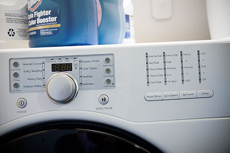
One of the things I’ve learned in my design work that while it might seem instinctual to always give more choices to an opportunity, giving too many options actually is counterproductive. While I don’t lament the passing of our old washer that no longer finished its cycles without human intervention or our dryer that needed 1.6 cycles to dry our clothes, my first reaction to the “wealth” of cleaning and drying options on our new washer and dryer pair was “Hmm… cool buttons, but lots of cool buttons.”
I made a social commentary on our first washer’s load size options on the first photo of this series and I’ll make another one for our new washer. In our age of technology where our tools have become complex, I think the product designers have lost sight of simplicity by engaging in feature wars with their competitors. While the load sizes of our previous washer was humorous, I admire the simplicity of small or extra large, and hot, warm, or cold.
Having said that, all the buttons, sensors to detect clothes load size, automatically adding softener at the right time, countdown timer until completion, and a front window to see all the action is pretty darn cool—in a geeky engineer sort of way.
One reply on “The Cost of Choice”
Hahaha, nice post, Dave. I can only imagine they’ll stick a touchscreen on these washers and dryers that will have a guided-tour approach to create new clothes profiles that you can save for future wash/dry cycles. Sounds like a fun project!
In any case, congrats on the new washer/dryer combo. I hear the high efficiency machines (which looks like what you got in the photo) not only saves water and energy, but uses less detergent and is easier on the clothes so they don’t break down as quickly. Win-win-win-win!